Logo Story
Let me take you behind the scenes of something personal. What may look like just a logo holds a part of my story. Some of its elements were thoughtfully designed to reflect my mindset, creativity, and personality. It's not just a design—it's a glimpse into who I am.
Let’s rewind to the days when I was all pumped up doing the #DailyUI challenge — yes, that phase where I thought I’d design something every single day (spoiler: I didn’t). Most of the designs you see in my Figma community actually came from those early, enthusiastic days. I only managed a handful before getting pulled into the black hole of major projects and case studies — you know, grown-up design stuff.
Anyway, Day 5’s prompt was to design an App Icon. That’s when a spark went off: “Why not make something that actually feels like me?” With a mix of excitement, overthinking, and a slight fear of the blank canvas, I jumped into designing what would eventually become my logo — a tiny, honest attempt at turning my personality into a symbol.

Initial Drafts
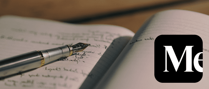
I love brainstorming on pen and paper, so I often jot down ideas as they come to me, without overthinking or complicating things too much.
Although my full name is Akash Chimkar, the typical abbreviation would be AC, but I usually go with AK — drawn from the first two letters of my first name. It seems cool to me and instead of sticking to the usual initials, I gravitated toward a more personal and creative shorthand. During a time when I was sharing my design work on Figma, the name AKfigma came to mind — simple, easy to remember, and distinctly mine.
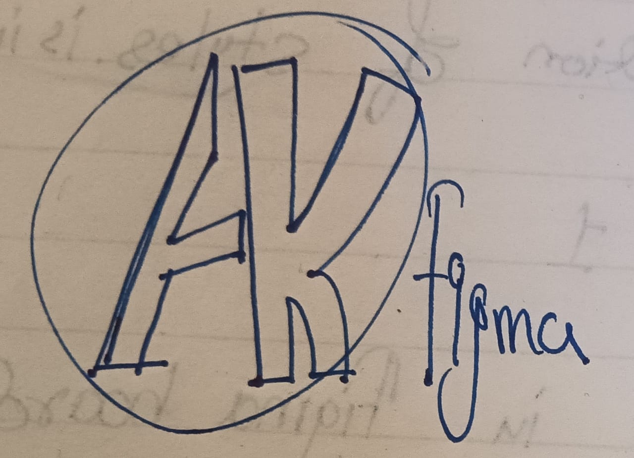
For my first draft, I kept the A’s sharp and straight, while the K got a nice curve — a little nod to the balance between my playful and serious sides. I even went with a small-caps font for "figma" to keep things sleek and tidy. But then... oops — the A started looking way too much like it was ripped straight out of the Avengers logo. Not exactly what I had in mind!
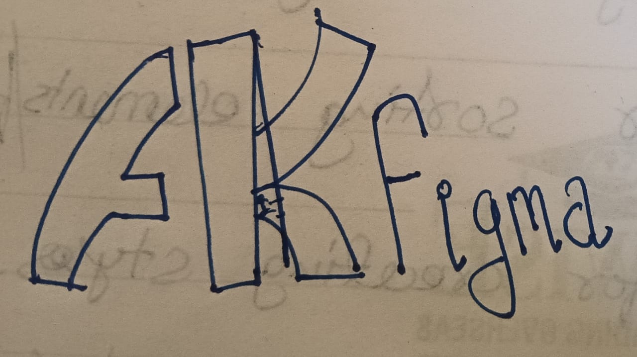
As much as I love superheroes, I wasn’t ready to risk a future lawsuit with Marvel — so I gave that A a little makeover. I curved it to match the K’s vibe and dove into the vector points like a detective on a mission. A few tweaks here and there, and boom — no more accidental Avengers homage!
Logo in Figma
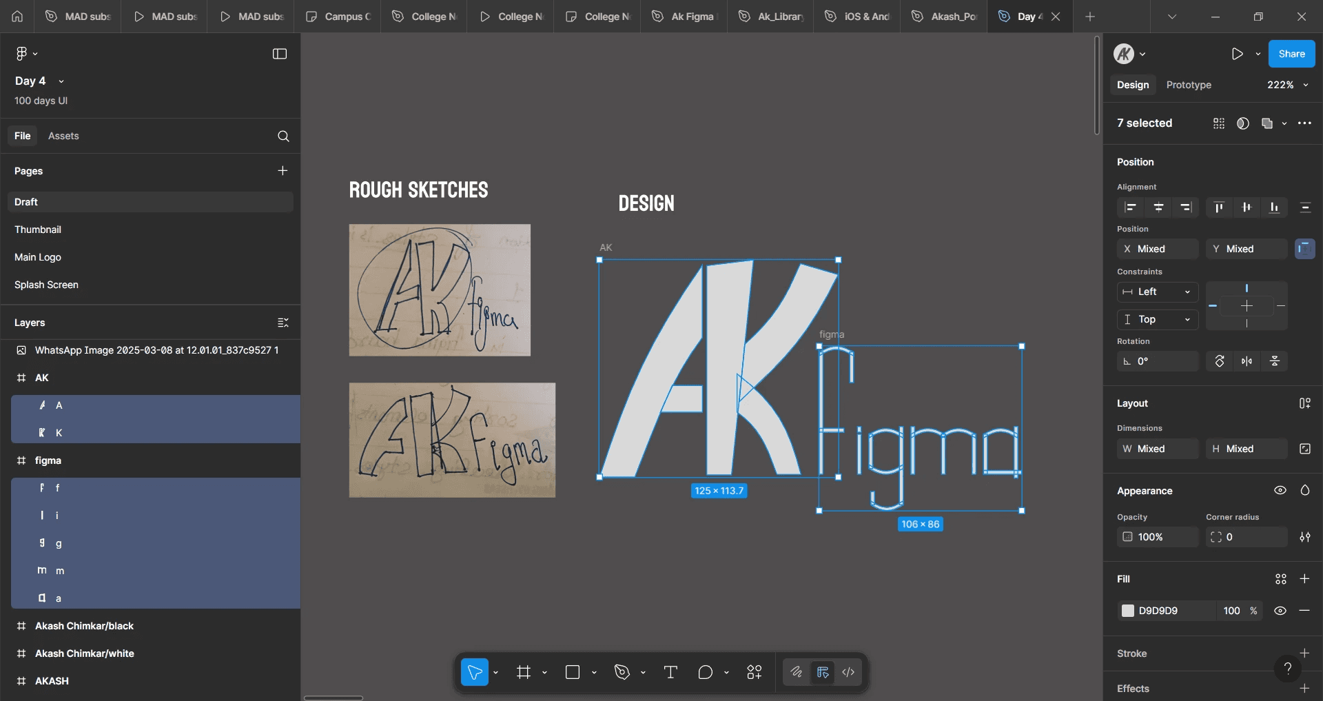
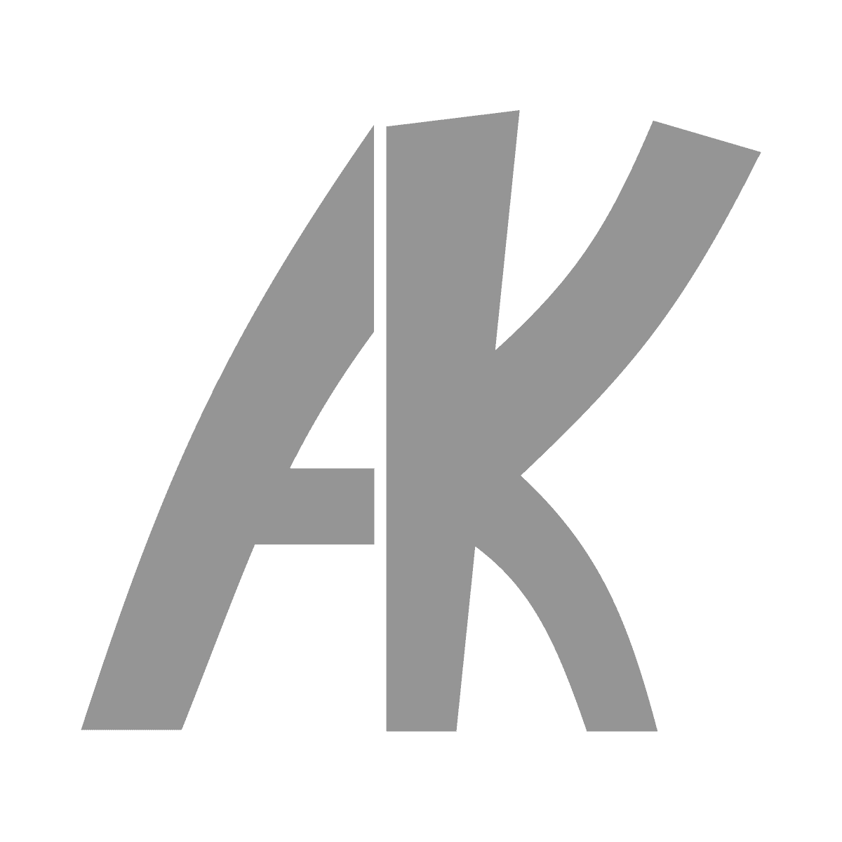
I literally pasted my paper sketch onto the canvas and started figuring out how on earth to make a vector logo. You’ll probably spot a bunch of overlapping layers — classic beginner move! I was just placing rectangles, dragging curves, and wrestling with the pen tool like it had a mind of its own. But after a lot of trial, error, and zooming in way too much, the vector logo finally came to life.

I wanted it to be my profile pic on Figma, Dribbble, Behance... basically, everywhere! So I started exploring all the ways I could present it. I ended up sticking with greyscale tones, not just for the aesthetic, but as a nod to where I was in my journey — a beginner, still in the early stages. And fun fact: in UI/UX, wireframes (aka the rough blueprints of ideas) are often done in shades of grey. It just felt right — like my logo was my own little wireframe moment, full of potential and ready to grow.

example of wireframe from my case study
From Monogram to Full Identity
What began as a simple "AK" monogram evolved into a full representation of my name. I wanted the logo to be more than just initials—it needed to encapsulate my entire identity. So, I started experimenting:
Kept "AK" as it is, representing the beginning.

Removed "K" to simplify and focus on the "A".

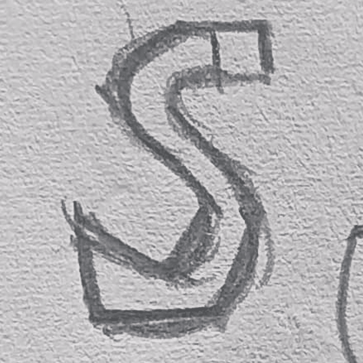
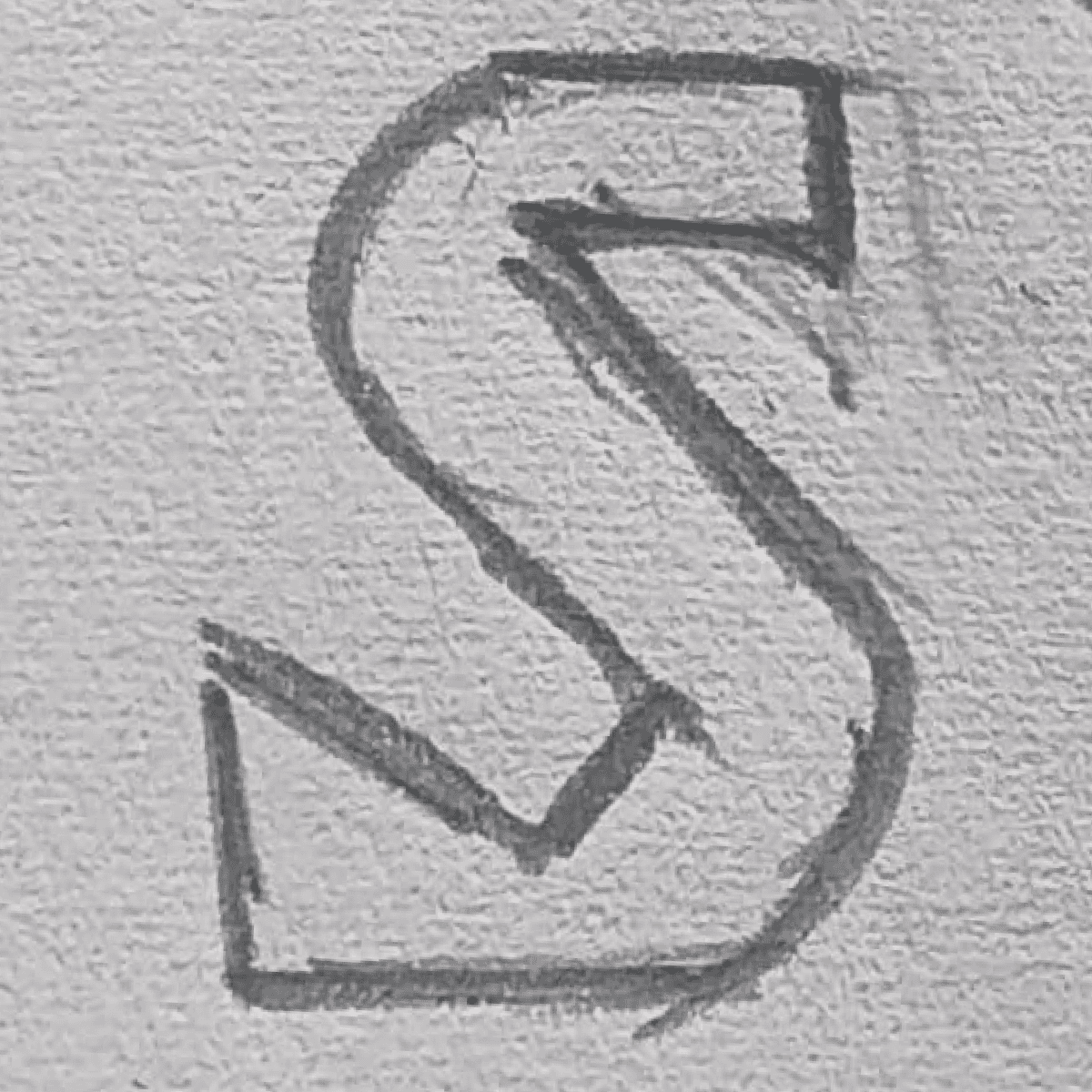

Transformed "S" into a swan, symbolizing my affinity for birds and adding a graceful touch.
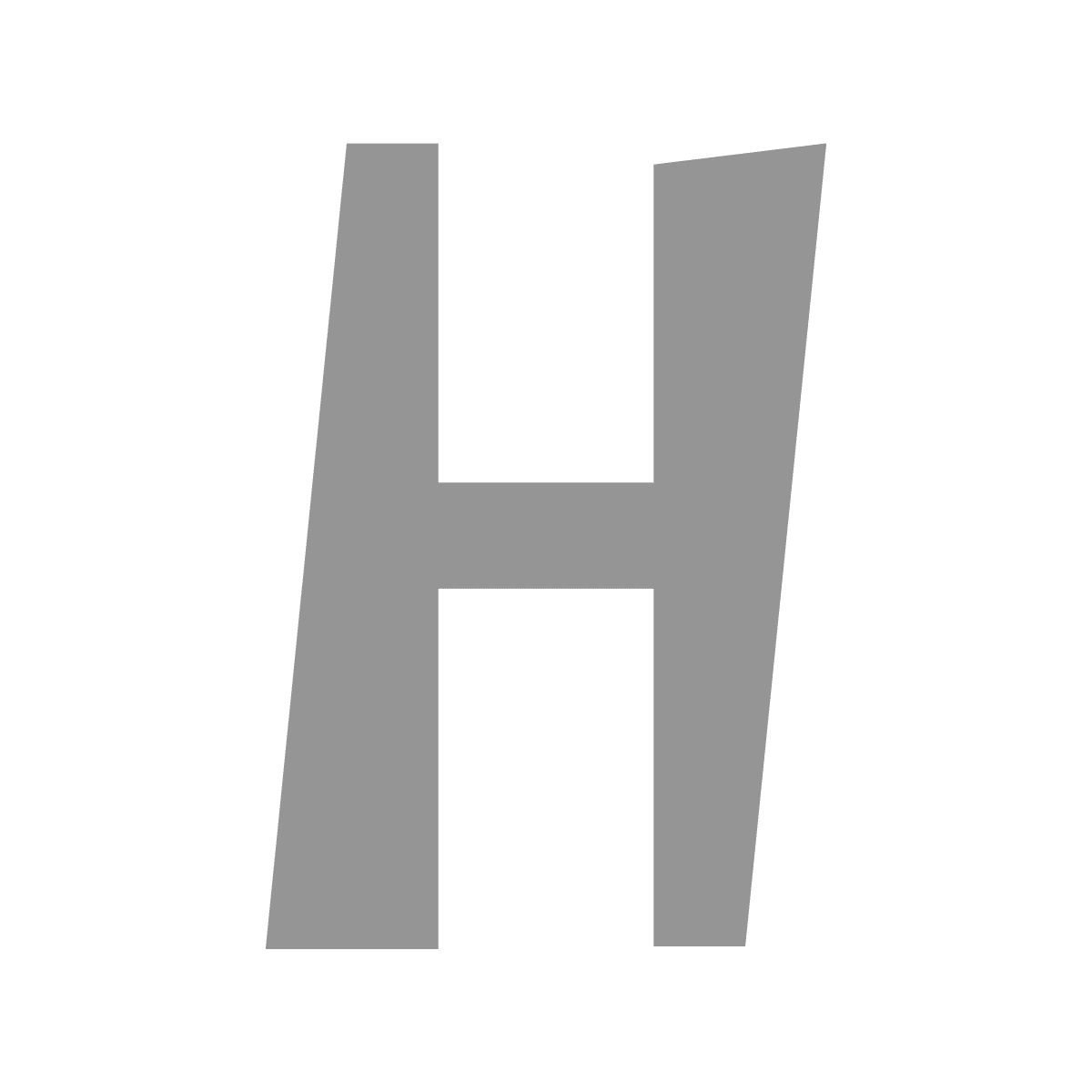
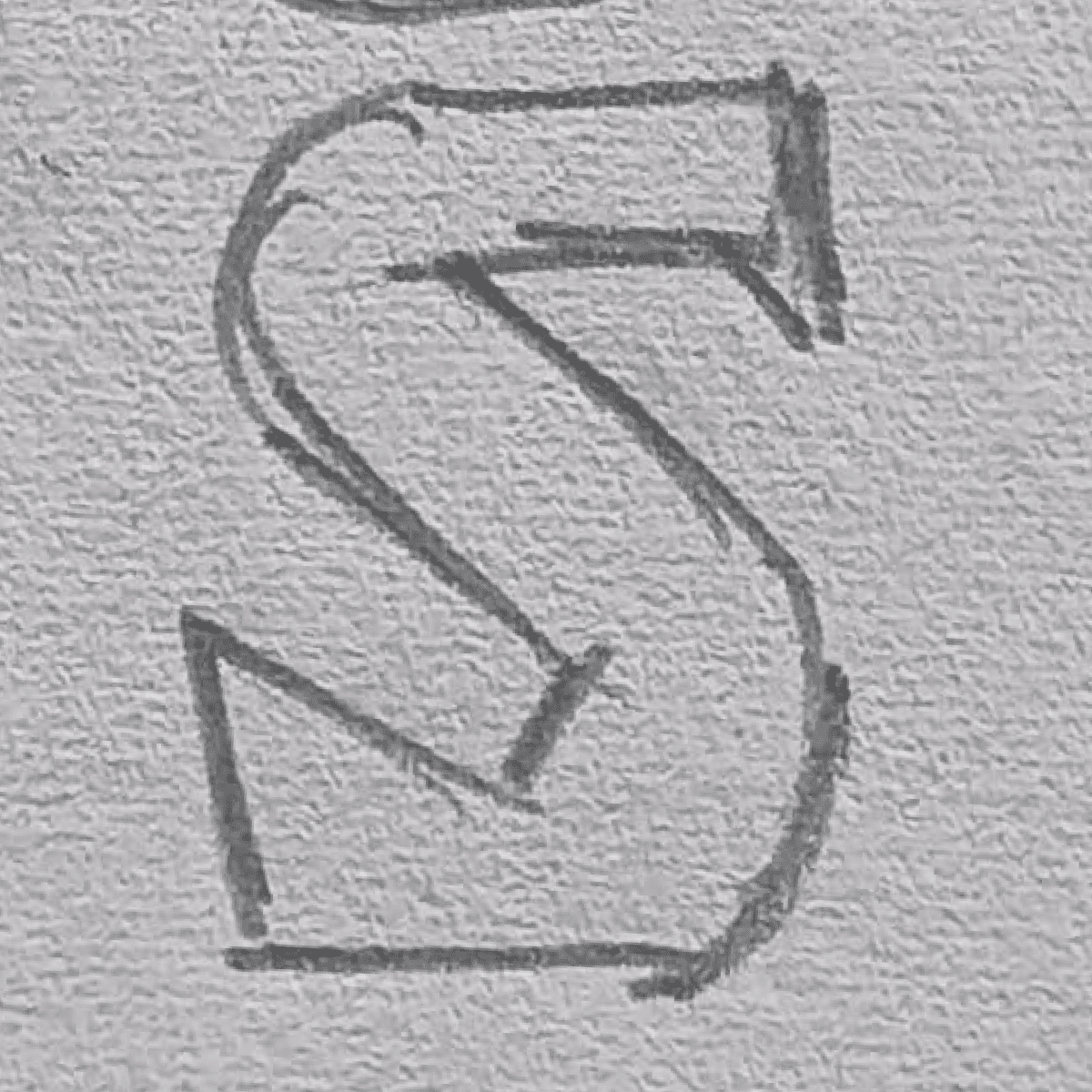
Designed "H" with an optical illusion—straight on the inside, distorted on the outside—to reflect the duality in my design approach.

I retained the previously designed Figma font but converted it to uppercase to honor my family name and give it the respect it deserves.
Final Touches
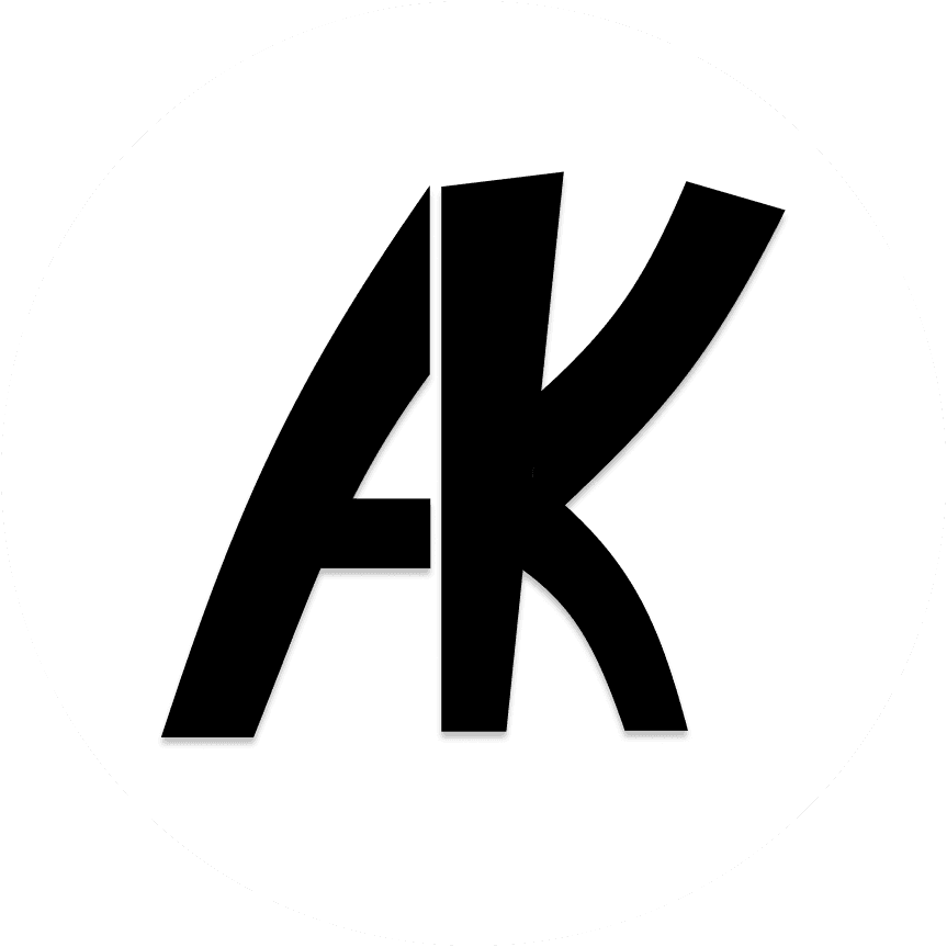
To wrap it all up, I went with black — bold enough to stand out, neutral enough to not scream. Honestly, it just felt right. No grand symbolism here — just me, trying things, messing up a bit, and somehow landing on something that actually felt... like mine.

Thanks for sticking around till the end — it means a lot. This little journey from pencil sketch to pixel-perfect logo has been full of experiments, happy accidents, and a whole lot of learning. I’m glad you took a moment to be part of it.
Here’s to many more design detours and discoveries ahead — and maybe a few less overlapping layers next time!